Florian Cramer
Florian Cramer, is an applied research professor and director of Creating 010, the research center affiliated to Willem de Kooning Academy and Piet Zwart Institute at the Rotterdam University of Applied Sciences, The Netherlands.
Appraisals (78)

See Through (fractal)
Sell as a conceptualist riff on Georgia O'Keeffe.
Wave (fractal)
The worst of Max Ernst combined with the worst color palette from suburban drive-in discount furniture store. Don't sign, but sell in a Heavy Metal poster store, or cut out the middle men and sell it to your local Hells Angels chapter as club house decoration.
Formalist Zombies
Asger Jorn meets Jeff Koons meets Furry anal porn meets the Czech animated cartoon of the Little Mole. Highly sellable as contemporary pop art.
Curtain (fractal series)
Sell this as porn to increase its value, and therefore do not sign.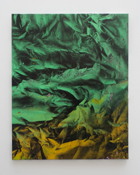
The Unwilling Successor #2
The revenge of Georgia O'Keefe in uncanny colors and shapes. Good enough for small town art centers in the American Midwest, Germany or the Netherlands.
Nude Topless Woman
Increase its value by claiming that it's a parody of Tracy Enim's bed.
Brutalist Posters (fractal)
The kind of painting that is typical for the second half of the 80s when every provincial town had its own neo-expressionist epigone. Unsellable today ever since even the original neo-expressionists fell out of the grace of art history and, more importantly, the art market.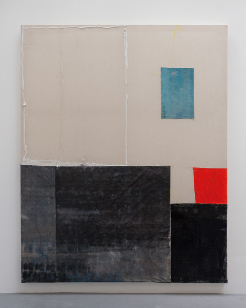
New Atlas
Arte povera version of suprematism, with a color palette straight from a discount furniture store. Sell as camp.
Blossom-Lullabies (Fotogram)
Don't sell this as painting but as experimental photography or stills from a Stan Brakhage film.
Extra Terrestrial (fractal)
Fake ethno art for bank lobbies. Too generic to sign, too sellable to destroy.
Untitled
A hybrid of Mark Rotko and Robert Wilson's set drawings with the glued-in Dutch paper tablecloth as an element of camp conceptualism. Definitely sellable to sophisticated collectors.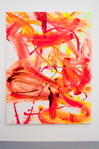
Princess Gifts Inc. (dayjob)
Perfectly generic, timeless, and fit for arbitrary recontextualization and historical labeling.
The Unwilling Successor
So ugly that it qualifies as camp.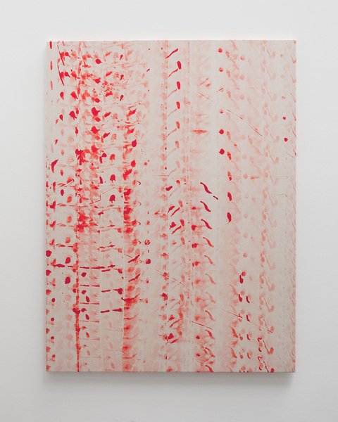
Laura Palmer's Curtain 2
Sell this as a clever conceptualist commentary on Yves Klein - where blue has been replaced with red paint, and naked female bodies with truck tires.
Offset Matterhorn #2
Pollock from the Shenzen factory III. (Consider making production more cost-effective.)
Offset Matterhorn #1
Pollock from the Shenzen factory II. (Consider making production more cost-effective.)
Untitled
Could be sold to Hollywood as generic "contemporary art gallery" set decoration. Since it's fairly neutral, generic and timeless and unobtrusive, it would serve this purpose well and achieve a good selling price. However, do NOT sign - this would destroy the possibility of customizing the signature for a particular film.
No Algorythm (Genesis) Fractal
Lucio Fontana meets Anselm Kiefer. But the texture/surface structure is too flat to compete with Kiefer's market value.
Offset Matterhorn #3
Looks like a Pollock knock-off made in a factory in Shenzen. As a product made in Amsterdam, it's however not economical. Either outsource this painting labor to low-wage countries or automate production if you want to survive in the market.
M.R. Ducks (Day Job)
This kind of painting will always work, any time (whether 1950s, 60s, 70s, 80s, 90s, 2000s), and is flexible enough to be given any matching contemporary attribute.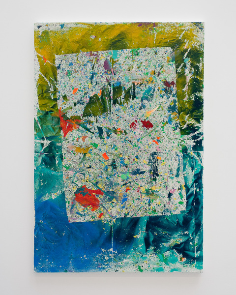
Meta (fractal)
A poor man's version of Jasper John's weak post-1980s work. Don't sign, but sell in poster shops and department stores.
The Patron Saint of Process Based Abstract Painting
This piece could work as "reverse appropriation art" - i.e. a work that will be conceptually dated back to make it fake old. As an Asger Jorn/COBRA work of the 1950s or a Markus Lüpertz work of the 1980s, this would reach gullible collector's markets as (a) a criminal fake, or even better: (b) as a fake declared conceptual art.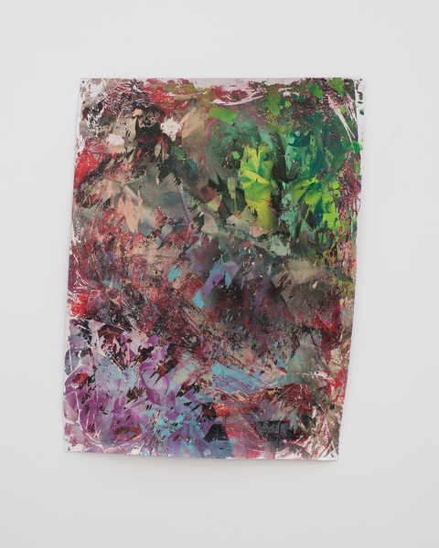
Reverse Mock-up (Fractal)
A perfect fit for small town or rural hairdresser's outfit where 1980s/1990s hipness standards have remained intact.
Huevo Eclectico (Fractal)
As Studio Practice progresses, color combinations become bolder in challenging good taste. Now we're approaching Georg Baselitz' painting ca. 1980. Since there is still a large collector market for Baselitz, for whichever reason, the recommendation can only be: sign this work and sell it!
Double double
Cute. Will appeal as generic office decoration for people who collect and expose other cutesy on their work desks.
Untitled
Would be more interesting if it really had been painted with a truck having color on its tires.
Untitled
The cut-out work areas are getting tired.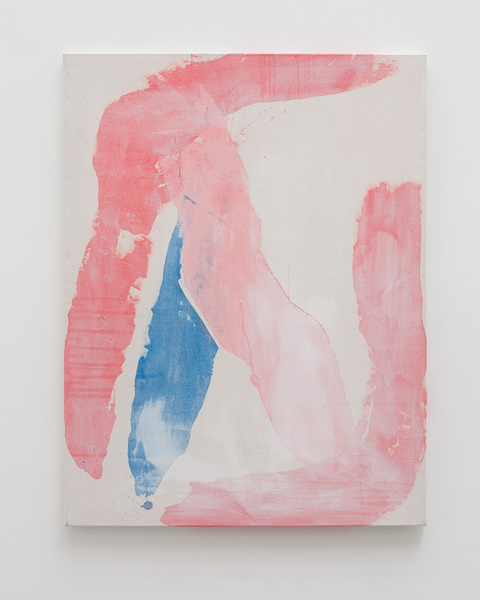
Untitled
Offers too many possible (psychoanalytic/obscene) interpretations to work as a generic piece of corporate office decoration.
Untitled
Would appeal to many buyers as generic office decoration.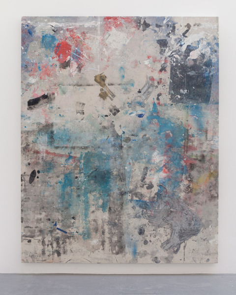
Untitled (floor)
Another cut-out work area. Highly uninspiring.
Untitled (floor)
Another cut-out work area. Uninspiring.
Untitled (floor)
Another cut-out work area. Uninspiring.
Untitled (floor)
Looks like your average contemporary art work where some painter's working area has been cut out and framed. Worn out, and done better before by artists like Daniel Spoerri and Dieter Rot.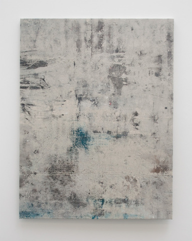
Untitled
This is just ugly.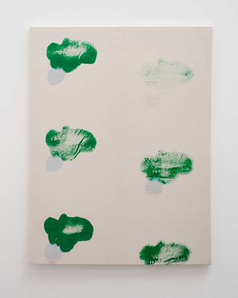
Double double spinach trouble
This looks like really bad 1970s art.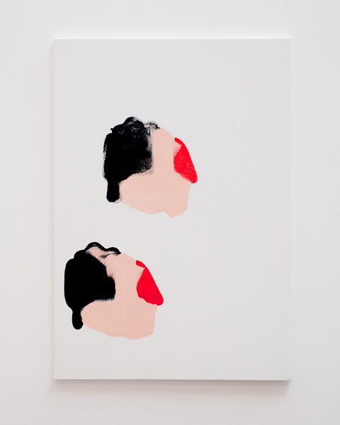
Double
The smoking walrus with anal bleeding (see above) has mutated into a blind elephant with anal bleeding. Don't use the same pun twice.
Tits
Miró meets surrealist decalcomanie in early 70s left-wing West German printmaking aesthetics. Could also interpreted as a smoking walrus with anal bleeding. An odd bastard, could be used as a subversive piece to be sold in poster shops. Keep, but don't sign.
Lazy Eye (prism exercise) No. 1
So terribly generic that it even fails to meet standards of corporate office decoration.
Laura Palmer's Curtain
This work has undeniable calligraphic beauty. My advise is to position/market it as concrete poetry rather than visual art.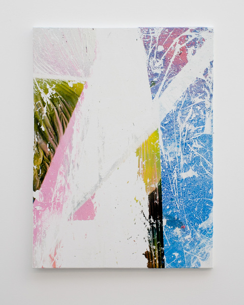
Untitled
Reminding of late 1980s painting made by a lost generation of artists who came a too late for the boom of abstract expressionism but weren't ready for the return of conceptual art either, and ended up make their living from private painting lessons for smalltown hobbyists.
Untitled
Could work as a design for a shower curtain. Therefore: Don't destroy it, but don't sign it either.
Untitled
Neo-expressionist/-primitivist work reminding of German 1980s painting (Dahn, Fetting, Dokoupil). Retro enough to be hip again. Could be sold to a club or a bar.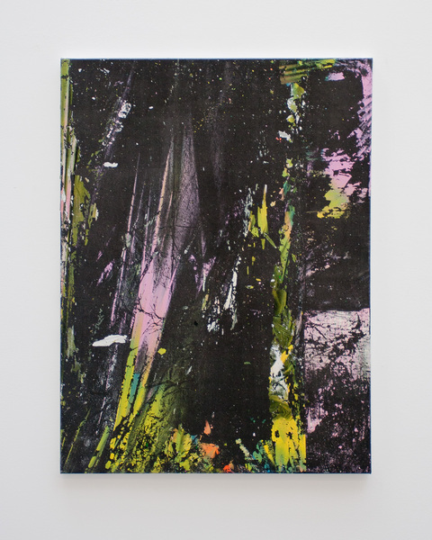
Untitled
The colors are too ugly for corporate office clients, but not ugly enough to be provocative as gallery art.
Untitled
A rehash of Gerhard Richter's and Sigmar Polke's ironic post/meta-abstract art of the 1970s and 1980s. Therefore, it's too late for the contemporary art market while also being too sophisticated for low- and middlebrow corporate clients.
Untitled (photogram)
looks like a still frame from a 1930s abstract film. Should be marketed to the film world rather than the contemporary art world.
Study for Fauntleroy No.2
Looks mildly interesting with its combination of blue, green and black tones, but ultimately remains to sloppy and generic to amount to more than wall decoration.
Study for Fauntleroy No.1
This could be hung in a generic hotel lobby. Sell for $500.
Composition (upwards)
Might at least double as a wildlife painting of falling leaves and thus corner two markets at once.
Butterflies (all over)
Generic nondescriptness.
Density (too definite)
More nondescript generic work.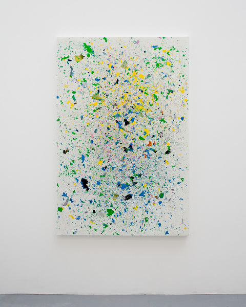
Micro Macro Situation
Highly generic. Needs some conceptual narrative in order to sex it up.
Untitled
The n-th generation of abstract/minimal painting. Just as boring as a wildlife painting. Destroying it would make it mildly more interesting.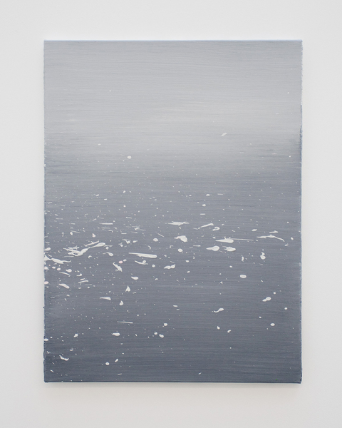
Untitled
Generic art for middle management. Could be interpreted as an ironical take on boredom (grey-blueish gradient) and ecstasy (the white spatter).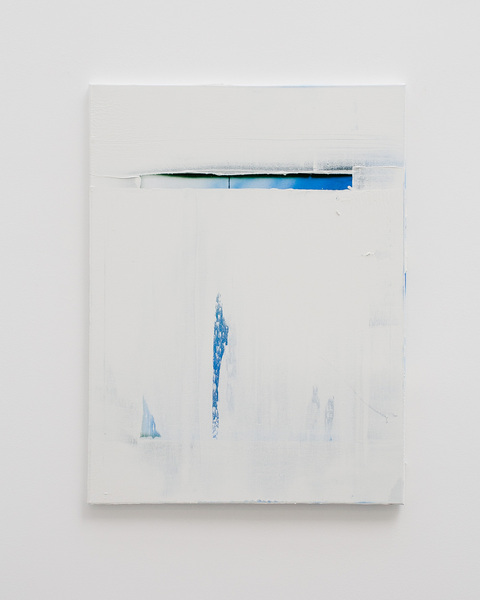
Untitled
Looks as if Manzoni had his hands on an Yves Klein painting, and somebody painted a quick-and-dirty remake of it based on a catalog reproduction.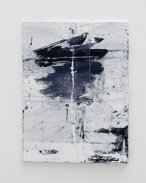
No.3 (Ordinal Series)
Nowadays, such painting is generic office decoration. Which, no question, still makes it a viable product and source of income for artists.
No.2 (Ordinal Series)
Nowadays, such painting is generic office decoration. Which, no question, still makes it a viable product and source of income for artists.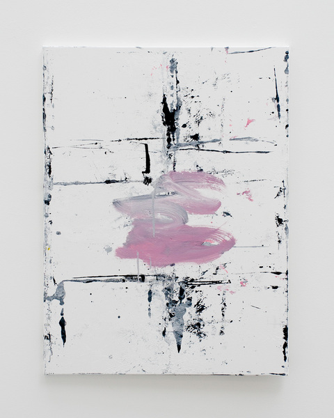
No.1 (Ordinal Series)
Nowadays, such painting is generic office decoration. Which, no question, still makes it a viable product and source of income for artists.
No.4 (Ordinal Series)
This is visually appealing enough, but, more than 60 years after abstract expressionism and artists like Rauschenberg and Twombly, doesn't cut it anymore as interesting contemporary art, except on a lowbrow scale (the kind of art made for regional art lending spaces etc.).
Process this 1
This looks just cheesy. It doesn't even appeal as a neodadaist work because its joke is too simple, and the execution too much in the style of generic third-rate contemporary art.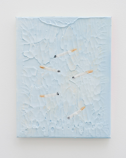
Process this 2
This looks just cheesy. It doesn't even appeal as a neodadaist work because its joke is too simple, and the execution too much in the style of generic third-rate contemporary art.
Untitled
Too obviously a rehash of 1950s painting, can therefore only serve low brow art markets.
Untitled (photogram)
This is a visually appealing work that takes the technique of the photogram and frees it from its 20th century language and associations.
Untitled
Yet another denim jeans riff on Yves Klein.
Untitled
Yet another denim jeans riff on Yves Klein.
Untitled
Yet another denim jeans riff on Yves Klein.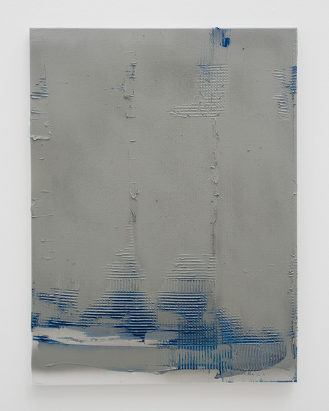
Untitled
Yet another denim jeans riff on Yves Klein.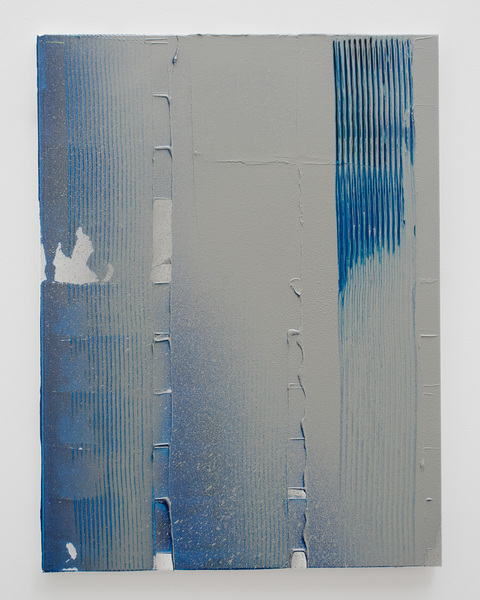
Untitled
Yet another denim jeans riff on Yves Klein.
Untitled
Yet another denim jeans riff on Yves Klein.
Untitled
An Eastern European conceptualist parody of Anselm Kiefer's work, reimagining it as cow skin.
Untitled
This looks cheap, as if it had been printed for a souvenir poster shop. Either a highly ironic commentary on post-1945 visual art or just some generic poster art kitsch.
Untitled
Appropriation art that copies an imaginary work of Piero Manzoni.
Untitled
Blatantly orientalizing in its attempt to mimick Japanese Zen calligraphy. Kitsch.
Untitled
This must be a late work of Dieter Roth.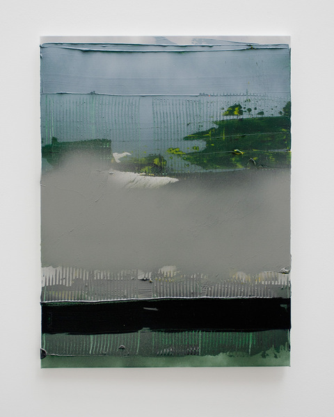
Untitled
The paintbrush strokes could be interpreted as producing an either abstract or figurative painting (a fence in front of a park). Reminiscent of Gerhard Richter's early 1970s work, and in some void between Jeff Wall and Mark Rothko. Could be sold to medium size regional businesses, or upscale hotels, as office decoration.
Untitled
Here the reticulation is exaggerated, which makes the comment on Tacita Dean too in-your-face to sell the painting.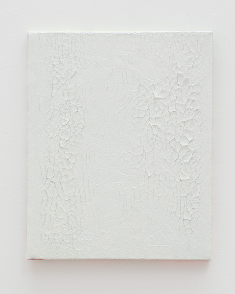
Untitled
A study of reticulation (as it can also appear in vintage film stocks) and minimal art. Could be seen as a commentary on Tacita Dean's most recent work. Should sell in a lower price range as office decoration for small to medium size businesses.
Untitled
A quick-and-dirty riff on Yves Klein, executed with a paint roller and cheapening his patented International Klein Blue color to a bleached-out denim blue. Could be used as CEO art for Levis' corporate headquarters.
Untitled
The work combines abstract expressionist gestural painting reminiscent of Pollock and Twombly with Mondriaan's elementary colors. It could thus either be seen as camp commentary on postwar modernism, or as a second-hand rehash belonging into a small town art gallery or, as generic ambient decoration, into the office of a middle manager of a bank or insurance company.
